The two storey void covered by the canvas canopy creates an open yet sheltered space.
The site slopes away quite dramatically towards the carpark at the rear.
Beyond the buildings across the street the site slopes away steeply.
The entry roof entices the consumer in.
Another shot showing the steep angle of the slope.
Walking from the top of the street towards the entry canopy, the CBD can be seen quite easily.
The CBD is easily visible from the site.
On the opposite side of the street the slope is also quite steep. This concludes that Paddington Central is perched on a peak.
Views are able to be seen on street level.
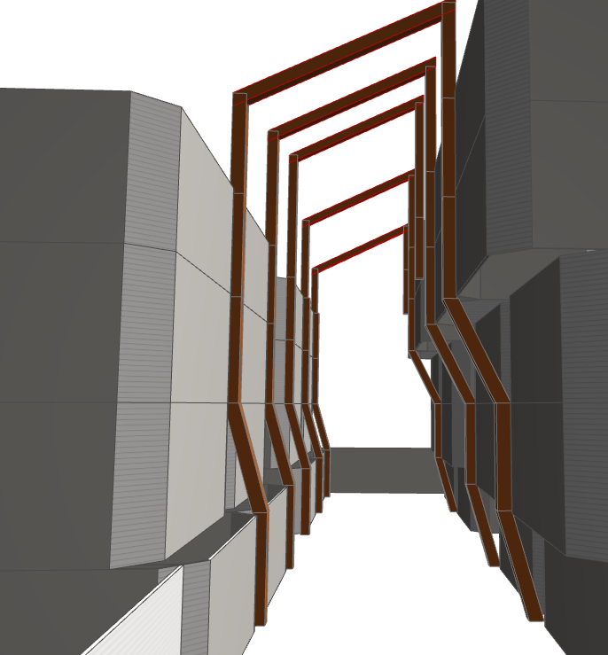
The dramatic use of perspective in the entry awning.
The view to the city beyond from the entry.
The use of lightweight steel construction with the canvas covering. Lets light in but keeps the weather out.
Professional suits can be seen up on the third level.
The lift core in the background is visible on the second level.
Three storey open space connected via escalators to the second level and stairs to the third level. The lift tower also connects all levels including two basement levels.
Distinct variances in design and colour of the separate buildings all connected by the lightweight canopies.
Side on shot showing the slope down Warmington street.
Professional suit level.
Timber catwalk from lifts to professional suits.
Very narrow escalators connecting the first and second levels.
Scale of the size of the void space.
Stairs up to professional suits.
List of businesses occupying the centre.
Entry via carpark at the back.
Lift core tower visible inside and out. Used as a communications tower.
Two car-parking levels.