Thursday 8 November 2012

Presentation Slides


I wanted to keep the gritty Sin City inspired branding through both the physical and digital presentation. At the bottom of the slide I incorporated the honeycomb element to link the integrity of the project together and also establish a visual link between the scenario put forward in assignment 1.


Acknowledging the mining bubble I used various forecasts and predictions to give the bursting point a date in 2013. I wanted this to occur early in the timeline to allow for a long period of financial hardship for the context of the storey.


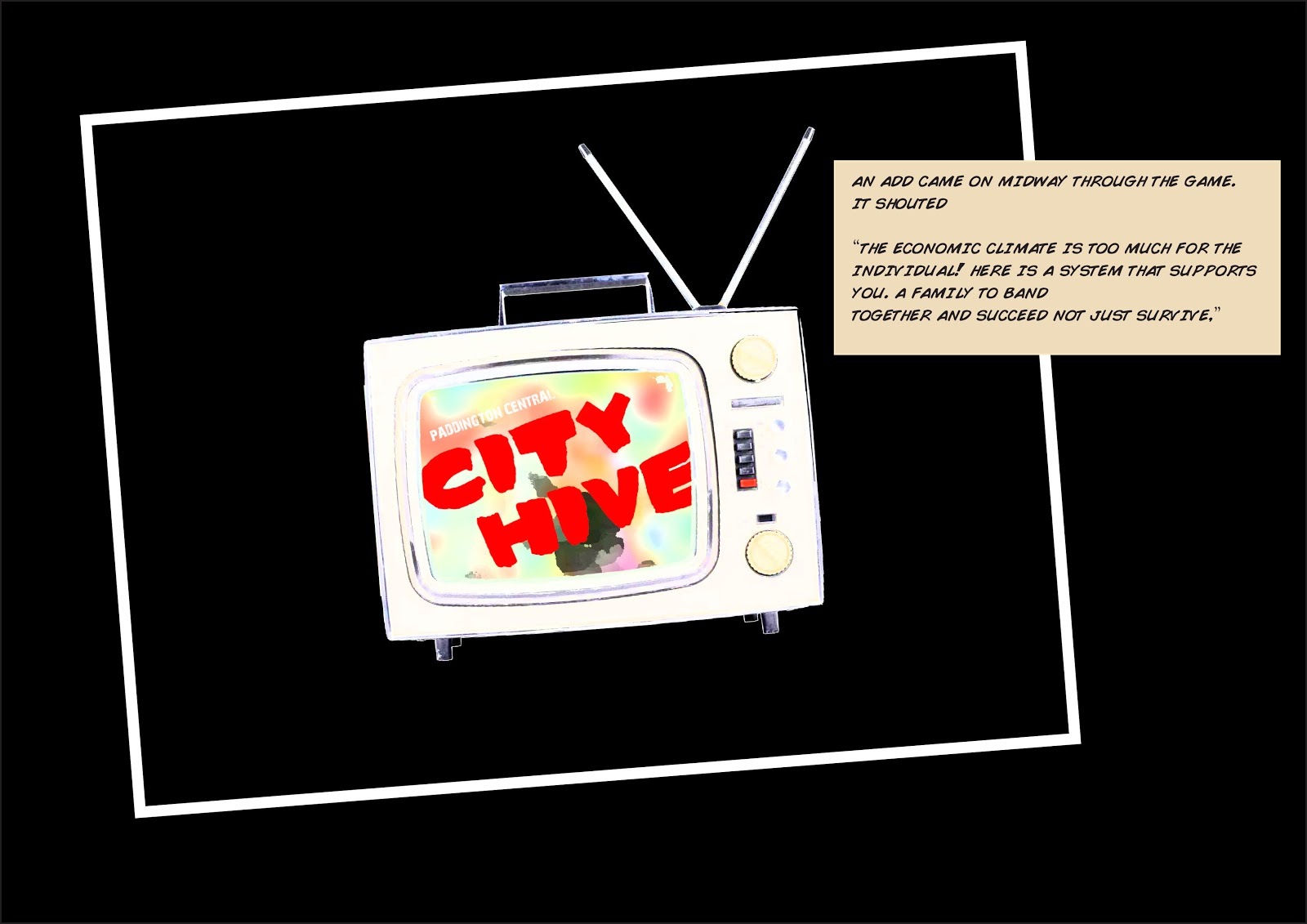
Acknowledging the cluster system and value placed on resources over money used in assignment 1, I was then able to springboard into the situation further.


I wanted to move away from the one person with authority and give a collective of people the chance to work together and create a better world for themselves.


This information above helped set the larger context of the narrative and justify why the character was to be laid off rom his job. The theory of the Hive was then able to be brought forward in the slides below.


These elements addressed by the design of the hive were able to be seen through the eyes and experiences of the characters in the narrative. The render below shows some of these elements in action.


The lower ground floor depicts the mix of new and existing infrastructure. The loading dock, carpark ramp, one storey buildings to the North, escalators and toilets/offices to the South-East remain. Both vehicle and pedestrian access are also shown. To the left where the above ground car-park used to be, the large space of the Australian native forest and garden can be seen.


The small vehicle navigation is clearly shown above. The new system of small cars allows fro a large percentage increase in the number of parking space.


The first basement level (shown above) is now used for a number of different uses, beneficial to both the residents of the Hive and the greater community. Sufficient general storage and bicycle storage are provided to residents. A solar plant to power the barbecues and washing systems is located on this level also along with both rain and great water tanks.

The element which is my favourite is the community food packaging and distribution area to the centre of the level. Local produce from the communal vegetable and herb garden along with fruit and other small crops from the larger native garden are collected and packed for distribution to the homeless population. This is a way for the people in the hive to give back to the community.


The pedestrian circulation to the typical upper floor plan above shows the importance placed on the catwalks to navigate between the residences and commercial parts of the Hive.


The typical unit skin to the Northern facade shows the treatment given to achieve the very authoritative feel seen by the character when he pulls into the driveway in the narrative. To create an eve without seeing it visually, a double skin is used. The secondary opening is from bi-folds that open up to reveal the primary open cut rectangular shaped open window that acts as a small balcony. This also gives privacy as the main public and resident garden is in front of this facade.


Both natural light and natural ventilation are brought into the depths of the structure through the three large atriums. Lovers to the top allow the hot air to escape and creating a natural circulation throughout. The angle of the atriums was designed to let the morning sun into the structure.


Personal touch is a big part of the human aspect of the Hive. I wanted residents to feel safe and structures yet also warm and pleasant. Small details such as handrails and internal cladding were addressed. The internal handrails on the catwalk balustrade are re-used timber balustrade hand rails from the now demolished Queenslanders in the area. The internal cladding is also form the external timber cladding from the decommissioned Queenslanders.


The idea of proximity to connect the residents of the hive was addressed by two elements. The lifts and the catwalks. The small number of lifts/stairs and narrow catwalks promoted  closer contact with people in the hive allowing conversations and possible friendships to arise.


The public pool at the corner of Latrobe Terrace and Warmington Street was designed to promote both public and resident interaction. The design was inspired by the original architecture in this location which can be seen above on the left hand edge of the pool terrace plan.


The external timber cladding shown by the red arrows above help show the visual softening of the strong facade.

The presentation was enjoyable to do and I thank both Cameron (my tutor) and Rosemary (the guest critique) on their comments and feedback.

A1 Summary Poster


In the summary poster I wanted to capture the main elements from the narrative, the aesthetic and the system as a whole. The hero shot in the top left as viewed by the main character of the narrative, was used to grab the attention of the eye upon first glance of the poster.  A brief overview of the criteria was then laid out to further paint the initial picture and give context to both the graphical and architectural elements of the poster. The strong architectural elements such as the natural light in the atriums is made a note of in the long section along with the compact parking which is explained in the story. 

The typical floor plan to the right gives an overview of the layout of the structure and begins to demonstrate the various systems working together such as commercial and residential. The section below identifies three key spaces in the project which are also featured strongly in the storey. These are; the cafe/restaurant street activation to Morris Street and Latrobe Terrace, the communal vegetable and herb garden & the large rooftop function space. 

The two perspectives to the bottom left of the poster are also featured in the narrative. They were chosen as they depict the buzz of activity both externally at the corner of Latrobe Terrace and Warmington Street, and internally showing both horizontal and vertical movement.

The text at the bottom is the definition of Hive mentality linking the entire system present in the design to a particular way of thinking.

Finally the caption "Coming to cities everywhere July 1 2034" implies that the financial situation is wide spread across Australia and possibly beyond. I chose July the first to give a bit of word play linking it to a new financial year.

Wednesday 7 November 2012

Development of barbecue and entertainment spaces (click to make image clear)


I wanted to create a modular/compartmental system on the roof terrace spaces allowing for mixed uses from sports to eating to laundry. An idea I had for the barbecue was that it could recess into the terrace floor when not in use allowing for an open fully usable space. This would be possible as the roof terrace had considerable depth to allow for the luminescent strip of light that circumnavigated it.

The second image was a depiction of digital projections onto the building. Learning about this in earlier years I understand it is quite a successful tool for both entertainment and aesthetic elements. I considered having this onto the exposed atrium on the eastern face/Warmington street. Having the public pool at this location would be a great way of really activating the street and drawing in people to the Hive.

- Posted using BlogPress from my iPhone

Development of presentation slides (click to make image clear)


I wanted to create a cohesive brand between the A1 poster, the story movie and the presentation slides. This is always a fun process as it visually helps connect the architectural and narrative principles. I wanted the poster to break down the criteria simply and succinctly while the story board would elaborate on some key elements which were then explained through the slides.

Reality - With the economic climate increasing for the worst I wanted to create a scenario where the gap between rich and poor became large and everyday elements such as going out to dinner was to expensive and simply not done by those below finical gap.

I did some research on current predictions to aid to the reality of the financial narrative.

I chose to include data showing increasing electricity costs to accentuate the rising bills and the stance taken by the Hive to combat this through means such as solar energy.


Aemo. "Rising Electricity Costs." Accessed November 05, 2012. http://www.aemo.com.au

Australian Bureau of Statistics

The mining boom was also included as many forecasters are saying the bubble is going to burst. The Australian economy would definitely take a huge hit as the percentage investment is heavily weighted in favour of mining. In my narrative I decided to have the bubble burst in 2013.


Stage:

Purpose - The purpose of the Hive was to create a space and a system that could band a group of people together to work, live, learn, grow and succeed despite the overwhelming financial weight against them.

Navigation - Thinking about navigation I wanted to reinvigorate and reuse the street access points. The catwalks were to play a large part internally and only two cores to further bring people into circulation proximity. I also thought about public and private spaces with an after hours swipe access for Hive residents. 

Integrity - I wanted to keep the design true to the site both in the experiential and certain aesthetic elements. The grid of the lower ground floor was kept and informed the direction of the design both in plan and elevation. I also wanted to keep the design true to the suburb as a whole. Paddington has alot of nice Queenslander homes that by 2034 would have vastly disappeared. Facade and internal treatments were used to tie in with certain elements that are iconically Queenslanders. The timber cladding was used and the timber handrails along the catwalks.

For some of the existing infrastructure to the base at the Northern end, I wanted to put steep corrugated iron hipped roofs to add to the flavour of the past and increase rain water collection.

Scene:

Presence and identity - The hive like aesthetics of the design helped join the complex elements into one visual system. The large wrapping roof was a key element to this and it can be seen from any aspect of the building both externally and internally. 

First person experience - To live at the hive residents receive a reduction in rental costs by agreeing to work at the Hive. This creates an internal community where everyone is working together to support the 'family'.

Small details like the shape of the pool were used to tie back to the original architectural feel of Paddington Central shopping centre.

- Posted using BlogPress from my iPhone

Story development cont. (click image to make clear)


Brainstorming various ideas and scenes for the story was a fun process as it enabled me to get a better contextual understanding of my design and how it relates to the individual. The above text depicts a wedding scene on the large roof top terrace. The character had a daughter who got married and had the reception at the Hive free of charge as the father was a member. "A bit easier on the old man's wallet too." was the remark made by the main character. At this point the Hive in the story allowed residents to hold functions free of charge to their family members even if they weren't residents of the Hive.

The reason why this didn't go through to the final story was it painted a picture of the character being alot older than what I originally intended. Even though I drew inspiration from Bruce Willisis' character from Sin City I wanted the main character to resemble a similar age to myself to better relate to my peers and have them engage more into the story. The characters age and face aren't really revealed in the final story to add further mystery and help the viewer connect putting themselves in the characters shoes.


- Posted using BlogPress from my iPhone

Mapping out the storyboard (click to make image clear)


I wanted to create an opening scene that depicted the characters personality, lifestyle and view reflective of the economic climate of 2034. I chose a night time city apartment scene to help paint this picture. The character appears alone and somewhat without hope especially when the narrative explains he will become homeless the next day. Depicting the blasé response to the large pile of bills and debt the character was in was key here as it shows this has been going on a while making the character somewhat emotionally numb. His reaction to losing his job gives the viewer the impression that he already knew about it before the opening scene hence why he was going out on the street as he could no longer afford rent.

The depiction of the television being rather vintage gives some depth to the character that perhaps he is a bit nostalgic of times gone by. Before the worlds finances took the downhill turn. I thought I would occasionally bring this characteristic forward throughout the narrative aiding to both the backstory as a whole and the subtle history of the character himself.

The idea of the native jungle or community garden was to bring a natural element to the overall design. I wanted this large garden to have an assortment of crops both the members of the Hive and the greater community could look after and give back to those out on the street. Something to work on as a collective would bring the community together. Also the progress would be evident in the health of the garden and would spark a sense of achievement across the outside community and residents of the Hive alike.
Slide 11 was used predominantly to express the very strong facade through a human perspective. The elegant hive atriums contrasting against the strong solid unit facades create a mystery to the character and help inform to the viewer that there are multiple systems at play within the design as a whole.
Originally I wanted a section to show the transition between the ground and basement levels showing the community garden above. Once in the basement, special point is made to show the space saving attributes of the foldable smart cars which are owned by all people in the narrative. In the image below it shows just how space saving these cars can be once parked in the folded position.
Uber gizmo. 2102. "Hiroko self-folding electric car rolls out in Spain."Accessed November 5, 2012. http://www.ubergizmo.com/2012/01/hiriko-self-folding-electric-car-rolls-out-in-spain/
After the three months I wanted to show the everyday aspects of living communally in the Hive. Human aspects like doing the laundry was one way I wanted to portray the sense of community and versatility of the terrace roof spaces. The washing water would be recycled grey water or equivalent to be a part of the sustainable aspect. Provision for grey water treatment and storage would be located on the now unused first basement level.
The next slide I wanted to portray the internal navigation within the Hive. The main factors of proximity induced by the catwalks was a main point i wished to cover. Later this developed and took on a more personal role establishing a love interest between the main character and another resident of the Hive.
Finally I wanted to portray a shot from within a North facing apartment overlooking the large communal garden/forest below. I later decided not to go with this option as it would stray slightly form the narrative between the main character and his love interest.


- Posted using BlogPress from my iPhone

The story board


To put my personal touch in to the story I chose to base the character in some ways around me. I like Peroni beer and enjoy watching a good game of football. I linked this scene to the organic garden adjacent to the hive through the mention of organic limes.


My character's face was distorted to hide exact facials in order to give the viewer more of a blank canvas to give the story life on his/her own minds. In a way it could almost put them in the shoes of the character in turn adding to the human aspect of the design solution.


The frame above depicts the grim financial situation that is affecting many people in the city of Brisbane in 2034. With the increase in job cuts and cost of living, many people have been forced onto the street. 


The two hero shots I included as they are both on the A1 poster and in the presentation slides. Having them shown firstly through the eyes and experience of the character I feel was a good way to give them context and set up the design to be talked about.


The original street access was maintained on Warming ton Street however now it is more visually purposeful as you can see from the street what you are entering in to. i.e both the gym and the glass entrance atrium.


The use of light in the scene above was to depict a vibrant and welcoming image to the character amongst the stung architecture. The two work well hand in hand. i.e the light softens the architecture and the architecture magnifies the light.


Native Australian plants grow well in general and would do so easily in the Brisbane climate with its moderate temperatures and its sunshine and rainfall. Minimal upkeep as the garden consumes a large space to the North. Due to the gardens location and the buildings orientation, it would be in full sun most of the day.


This part of the narrative helps set up the presentation by creating a sense of mystery as to what would go on in the first basement level.


I allowed this period of time to help the character settle into the hive - to establish work, move into his new apartment and have an understanding of the system and the people that are a part of it.


This internal shot shows some connecting architectural elements that help connect the storyline. I removed the balustrades from view in order to dramatise the vertical effect and simply the detail for the purpose of accentuating the main narrative elements. The lift/stair core can be seen at the western end of the hive. This is where Amanda lives and also it is one of two vertical access points to upper levels of the entire hive accentuating the close proximity of the circulation spaces. The horizontal internal cladding shown also adds the 'touch' element to the scene as this is mentioned in the presentation slides.


I chose this particular view to show some of the systems working together. 1.) The hive roof wrapping around the BBQ roof terrace. 2.) The solar panels locating on the northern face in order to power the solar powered bbq and foldable canopy mechanism. 3.) The hive-glass balustrade to give a full user experience both vertically and in plan.

I chose these lights after experiencing what they feel like when I went to a Mumford and Sons concert this year. There is a great presence they give so I thought it a great choice for the wedding in the narrative and to also set the mood for the character development between the main character and Amanda.


I used a herb in the narrative to contrast the largeness of the building and show that the delicate side of life can exist within it. Emotions of love and its fragility shown through the herb Jasmine I believe shows that the design contains heart.


I feel it was rewarding doing the storyboard as it helps paint an emotive picture beyond the renders and plans. In the future as a designer I would like to use this method to promote my design ideas.